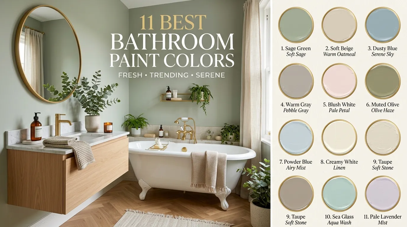
11 Best Bathroom Paint Colors
Introduction
Choosing the right bathroom paint color can completely change how your space feels, even before you replace tile, lighting, mirrors, or fixtures. Bathrooms are usually smaller than bedrooms or living rooms, so wall color plays a bigger role in the overall mood. A soft shade can make a compact powder room feel open and fresh, while a deeper color can turn a plain bathroom into a cozy, boutique-style retreat. That is why many homeowners across the USA look for paint colors that feel clean, stylish, timeless, and easy to decorate around.
The real trick is picking a color that works with your bathroom’s lighting, vanity finish, flooring, tile, and hardware. A shade that looks beautiful in a bright showroom may feel too dark in a windowless bathroom. A crisp white can look spa-like with warm wood accents, but it may feel cold beside gray tile and chrome fixtures. In my experience, the most successful bathroom colors are not always the trendiest ones. They are the shades that balance freshness, comfort, and everyday practicality.
This guide covers 11 beautiful paint color ideas that can work for small bathrooms, guest baths, powder rooms, modern spaces, farmhouse bathrooms, coastal interiors, and classic family homes. You will find soft neutrals, calming greens, airy blues, moody shades, and warm tones that photograph beautifully for Pinterest while still feeling livable in real homes. If you are searching for Best Bathroom paint inspiration that feels both stylish and practical, these color ideas will help you plan a space that looks polished, welcoming, and easy to love.
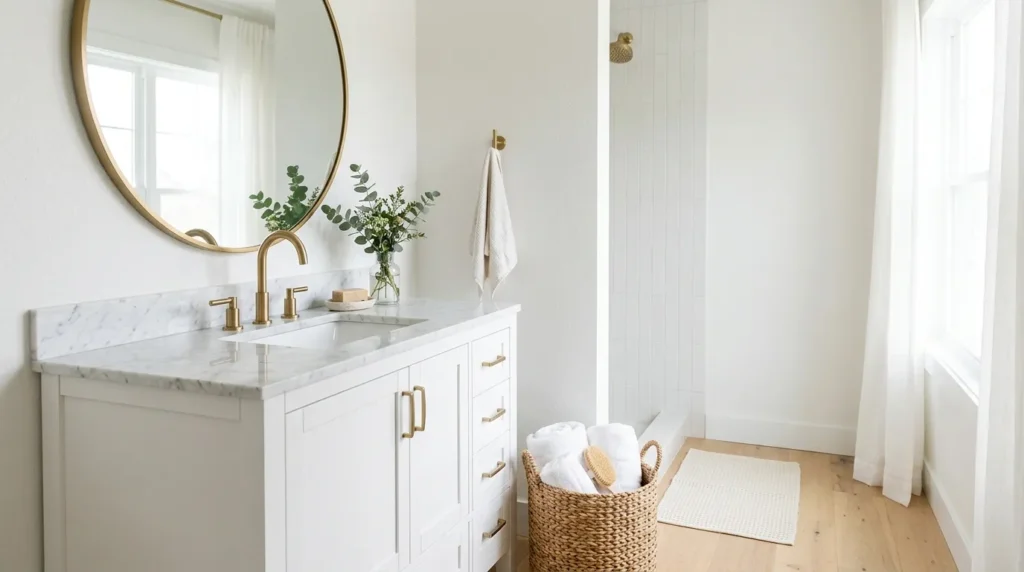
1. Soft White
- Makes small bathrooms feel brighter and more open
- Works beautifully with wood, marble, brass, black, or chrome finishes
- Creates a clean background for towels, baskets, mirrors, and wall art
- Helps reflect natural and artificial light in darker bathrooms
- Ideal for minimalist, coastal, farmhouse, and classic interiors
Soft white is one of the easiest ways to make a bathroom feel fresh without making it look plain. Unlike stark white, a softer white has a gentle warmth that keeps the room from feeling cold or clinical. It works especially well in USA homes where bathrooms often have limited natural light, smaller layouts, or mixed finishes. This shade gives you a clean canvas while still feeling comfortable. It also helps tile, mirrors, vanities, and lighting stand out in a calm and balanced way.
The biggest advantage of soft white is how flexible it becomes over time. You can pair it with woven baskets for a warm organic look, black hardware for contrast, or brushed brass for a polished designer feel. It also makes seasonal styling easier because towels, rugs, greenery, and artwork can change without clashing. I’ve seen this work well in many homes because it gives bathrooms a bright foundation while allowing the decor to bring personality. Use a satin or semi-gloss finish for durability.
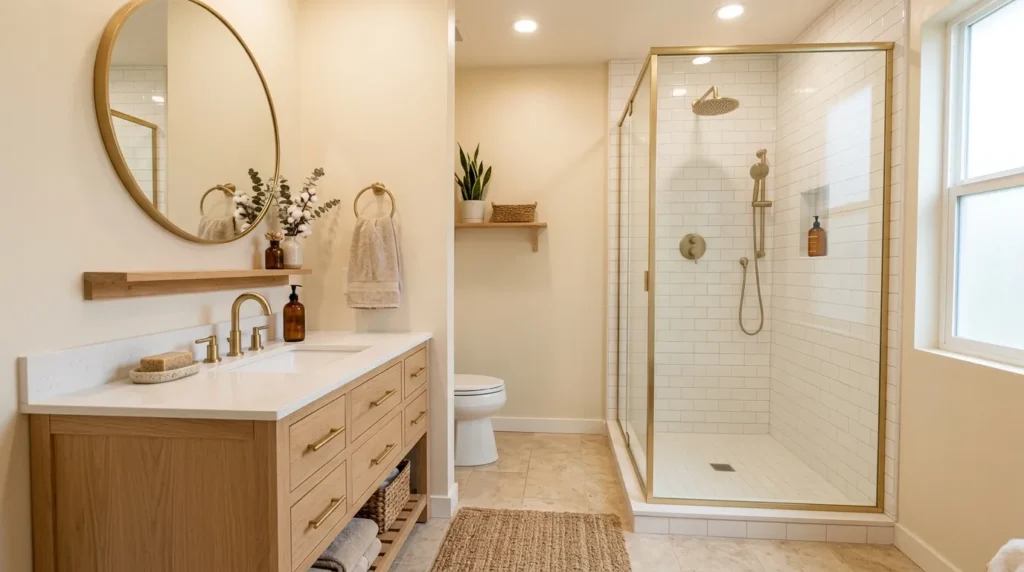
2. Warm Beige
- Adds comfort without making the bathroom feel dark
- Pairs well with cream tile, wood vanities, and gold hardware
- Softens bathrooms that have too much white or gray
- Creates a natural, welcoming look for guest bathrooms
- Works well in traditional, transitional, and organic modern homes
Warm beige brings a calm, cozy feeling that many bathrooms need, especially when the space feels too cold or unfinished. It is not the flat beige people remember from older interiors. Modern beige shades have softer undertones that feel sandy, creamy, and natural. This makes them perfect for bathrooms with white tile, stone-look flooring, wood accents, or brushed metal fixtures. The color adds warmth while still keeping the room neutral, which is helpful if you want a timeless look that will not feel outdated quickly.
This color can transform a basic bathroom into a softer and more inviting space. In a guest bath, warm beige feels approachable and polished without demanding too much attention. In a primary bathroom, it can create a quiet spa-like mood when paired with natural textures, linen towels, ceramic accessories, and warm lighting. That’s why many designers recommend testing beige against your tile before painting, because undertones matter. Choose a beige that looks creamy rather than yellow, especially if your bathroom has artificial lighting.
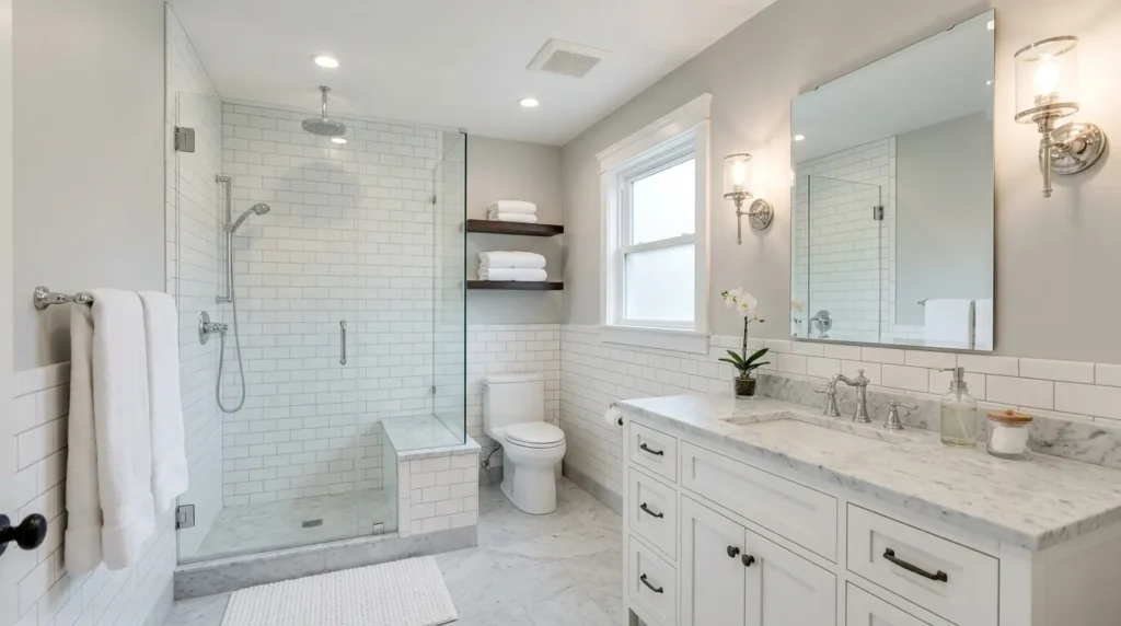
3. Pale Gray
- Gives the bathroom a clean, modern look
- Works with white tile, marble counters, and chrome fixtures
- Adds softness without feeling too warm or too cool
- Helps create a polished hotel-style finish
- Ideal for modern, transitional, and classic bathroom designs
Pale gray is a beautiful choice when you want a bathroom that feels calm, clean, and slightly elevated. It gives more depth than white but still keeps the room light and open. The key is choosing a pale gray with balanced undertones, because some grays can turn blue, purple, or dull under bathroom lighting. A soft gray works especially well with white subway tile, marble counters, glass shower doors, and polished chrome. It creates that crisp, organized feeling many people love in hotel bathrooms.
The transformation with pale gray is subtle but powerful. It can make older fixtures feel more updated and give mismatched bathroom elements a more connected look. For a warmer result, pair it with wood shelves, cream towels, and woven storage. For a cooler, sleek finish, use chrome fixtures, white linens, and charcoal accents. I’ve noticed pale gray works best when the bathroom has good lighting or bright trim. If the space is windowless, sample the paint first to avoid a shadowy effect.
4. Sage Green
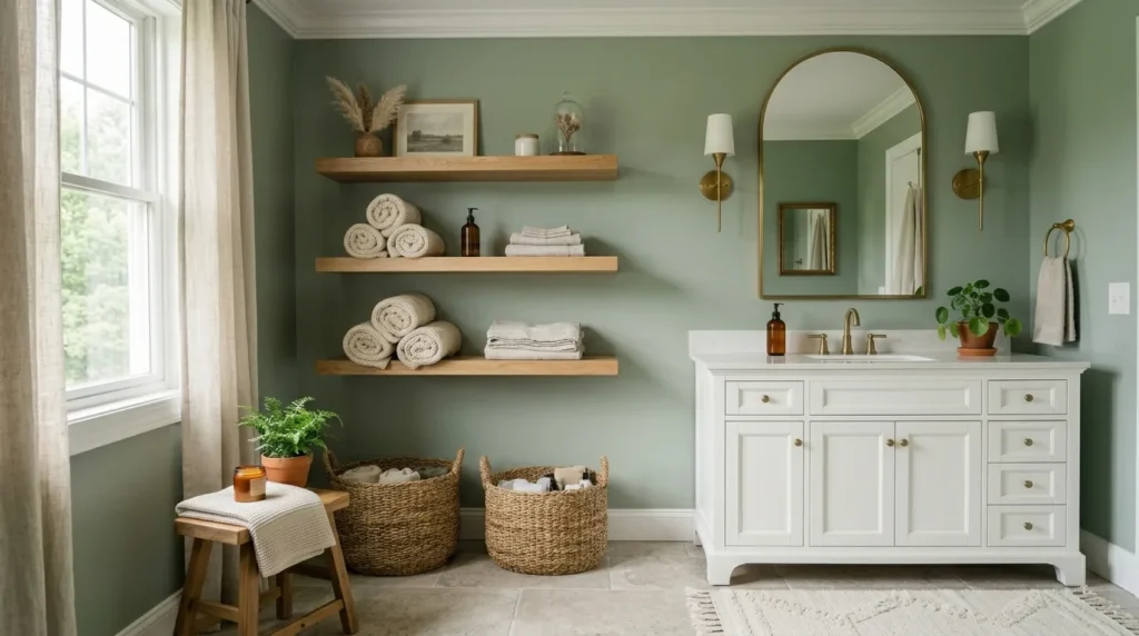
- Adds a calm, nature-inspired feeling
- Looks beautiful with white, cream, wood, and brass finishes
- Works well for spa, farmhouse, cottage, and organic bathrooms
- Softens hard surfaces like tile, mirrors, and stone
- Gives the room color without feeling overwhelming
Sage green is one of the most loved bathroom shades because it feels peaceful, natural, and stylish at the same time. It brings color into the room without becoming too bold or distracting. In bathrooms, where tile, glass, and metal can sometimes feel hard, sage green adds softness and warmth. It works beautifully with white vanities, wood cabinets, stone counters, and brushed brass fixtures. The color also connects well with plants, woven baskets, and simple ceramic decor for a relaxed Pinterest-ready look.
This shade can make a bathroom feel like a small retreat instead of a purely functional space. It is especially helpful in homes where the bathroom needs personality but still has to feel clean and practical. Sage green can lean earthy, gray-green, or slightly minty, so testing samples is important. In my experience, muted sage shades are easier to live with than brighter greens. Pair them with warm bulbs, creamy towels, and natural textures to create a soft, calming space that feels finished.
5. Powder Blue
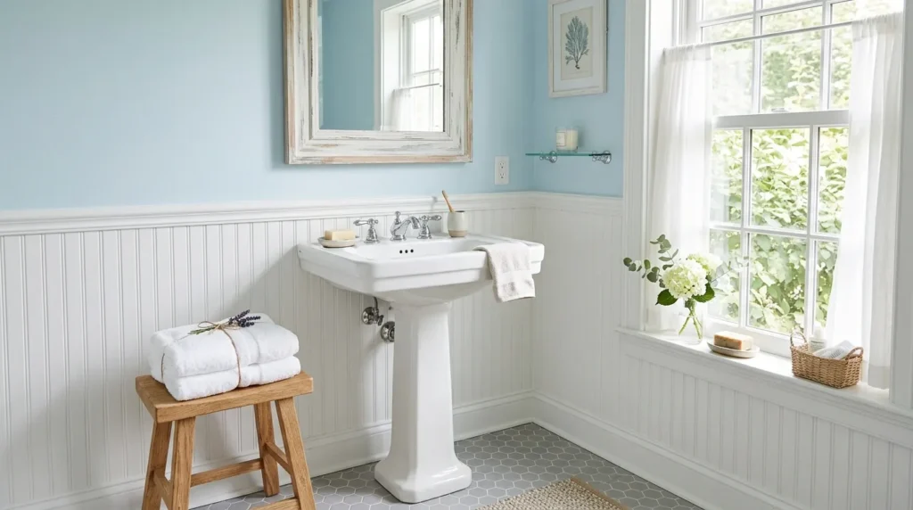
- Creates a light, airy, and refreshing bathroom mood
- Works well with white tile, coastal decor, and silver fixtures
- Makes small bathrooms feel gentle and open
- Adds color while keeping the space peaceful
- Ideal for coastal, cottage, traditional, and kids’ bathrooms
Powder blue gives a bathroom a fresh, breezy feeling that instantly makes the room feel lighter. It is a gentle color that works especially well in spaces where you want a clean but slightly cheerful look. Unlike deeper blues, powder blue does not overpower the walls or make the bathroom feel smaller. It pairs beautifully with white tile, beadboard, polished nickel, glass accessories, and soft gray flooring. This shade is also a favorite for coastal homes and family bathrooms because it feels calm and easygoing.
The beauty of powder blue is how simple it is to style. You can take it in a coastal direction with white towels, rope accents, and light wood, or make it more classic with chrome fixtures and framed mirrors. It also works nicely in bathrooms used by children because it feels playful without looking too themed. For the best result, avoid overly bright baby blue shades. Choose a dusty or muted powder blue that looks sophisticated in both daylight and evening bathroom lighting.
6. Greige Neutral
- Balances the warmth of beige with the softness of gray
- Works with many tile colors and vanity finishes
- Helps create a timeless, flexible bathroom palette
- Looks polished with black, brass, chrome, or bronze hardware
- Great for resale-friendly bathroom updates
Greige is a smart bathroom paint color when you want something warmer than gray but more modern than beige. It has a balanced quality that makes it easy to use in homes with mixed finishes, which is common in many USA bathrooms. If your tile is slightly warm but your fixtures are cool, greige can help connect everything. It brings softness to the walls while still looking clean and updated. This makes it a practical choice for remodels, rentals, and bathrooms prepared for resale.
A greige bathroom can feel simple, polished, and very livable. It works with white trim, stone counters, wood vanities, black mirrors, and brushed brass sconces. It also handles changing decor well, so you can refresh towels, rugs, and artwork without repainting. I’ve seen this work especially well in bathrooms where homeowners want a neutral look that does not feel boring. The best greige shades usually have subtle undertones, so test samples beside tile and flooring before making the final choice.
7. Dusty Pink
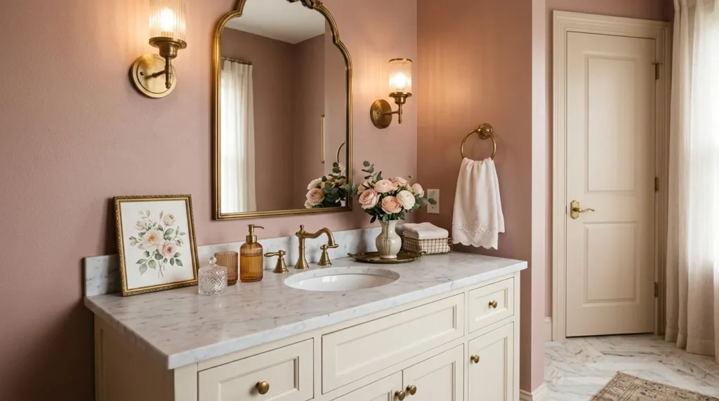
- Adds softness and warmth without feeling too bright
- Looks elegant with brass, cream, white, and marble finishes
- Works beautifully in powder rooms and feminine guest baths
- Creates a flattering glow around mirrors and vanity areas
- Pairs well with vintage, modern, and romantic decor styles
Dusty pink can make a bathroom feel warm, graceful, and surprisingly grown-up when chosen carefully. This is not a loud or childish pink. A muted rosy shade brings softness to the walls while still feeling elegant and calm. It works beautifully in powder rooms, guest bathrooms, and vanity areas where you want a little charm. The color pairs especially well with brass hardware, cream tile, white trim, marble counters, and soft lighting. It adds personality without making the room feel too trendy.
The transformation can be dramatic in the best way, especially if the bathroom currently feels cold or plain. Dusty pink can warm up white tile, soften black accents, and make metallic finishes look richer. It also photographs beautifully for Pinterest because it creates a gentle, flattering atmosphere. For a more modern look, pair it with clean-lined mirrors and simple fixtures. For a romantic look, add floral artwork, ribbed glass, vintage sconces, or soft linen towels. Keep the shade muted for lasting appeal.
8. Navy Blue
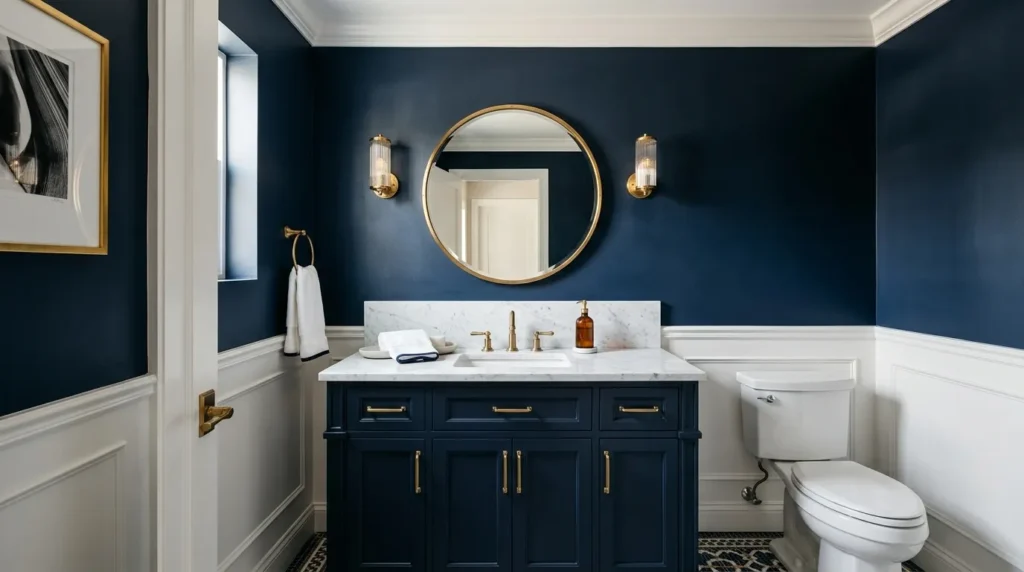
- Creates a bold, dramatic bathroom statement
- Looks stunning with white trim, brass hardware, and marble counters
- Works well in powder rooms and bathrooms with strong lighting
- Adds depth, contrast, and a custom designer look
- Pairs with modern, coastal, traditional, and luxury styles
Navy blue is perfect when you want a bathroom that feels rich, confident, and beautifully designed. It adds depth instantly, especially in powder rooms where a bold wall color can feel intentional rather than overwhelming. Navy works well with crisp white trim, marble counters, brass lighting, and polished mirrors. It can also make basic fixtures feel more expensive because the darker backdrop creates contrast. This color is not about making the room look bigger. It is about making it feel memorable.
The key to using navy blue successfully is balance. If your bathroom is small, use plenty of white, glass, or reflective finishes to keep the space from feeling heavy. A navy vanity wall, half bath, or accent area can create a dramatic focal point without covering every surface. In my experience, navy looks best with warm lighting and high-quality paint because dark colors reveal uneven walls more easily. Use a durable finish and pair it with simple decor so the color remains the main feature.
9. Charcoal Gray
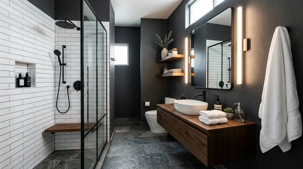
- Adds modern drama without using black
- Works beautifully with white tile, wood accents, and matte fixtures
- Creates a moody spa or luxury hotel feeling
- Helps lighter vanities and mirrors stand out
- Best for bathrooms with good lighting or strong contrast
Charcoal gray gives a bathroom a dramatic, modern edge while still feeling softer than pure black. It is a great choice for homeowners who want contrast, depth, and a more custom look. This color works especially well with white tile, light stone, floating wood shelves, matte black fixtures, and simple mirrors. It can turn an ordinary bathroom into a sleek, spa-inspired space. The shade feels grounded and sophisticated, which makes it especially strong in powder rooms and modern primary bathrooms.
Because charcoal is dark, it needs thoughtful styling to stay balanced. Add bright towels, good lighting, reflective mirrors, and lighter flooring to prevent the room from feeling closed in. A charcoal accent wall behind a vanity can be a smart option if you are nervous about painting every wall. That’s why many designers recommend using dark shades in areas where contrast already exists. When paired with clean lines and warm textures, charcoal gray can feel bold, cozy, and surprisingly welcoming.
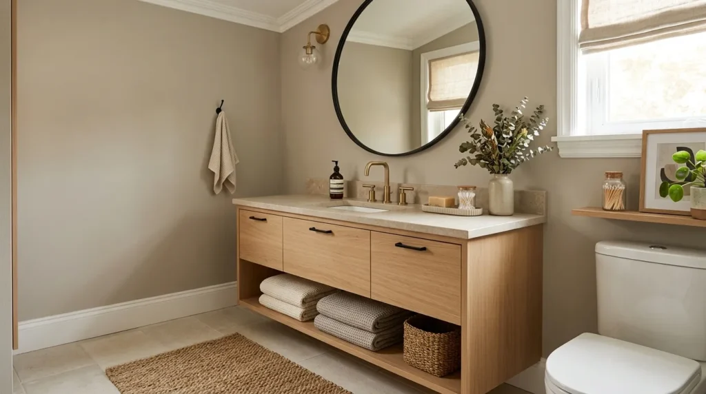
10. Creamy Taupe
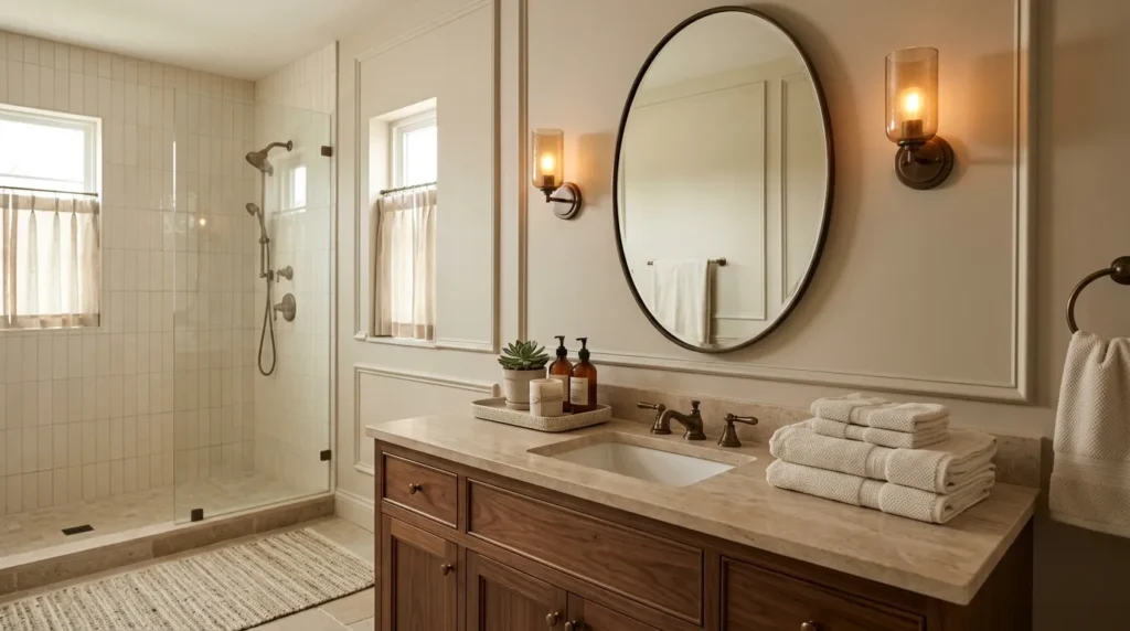
- Adds warmth with a refined, understated look
- Pairs well with stone, wood, bronze, brass, and cream finishes
- Works in traditional, transitional, and organic modern bathrooms
- Softens bright white bathrooms without making them dark
- Creates a calm, mature, and expensive-looking backdrop
Creamy taupe is a beautiful option when you want warmth, depth, and sophistication without choosing a strong color. It sits between beige, gray, and brown, which makes it incredibly versatile. In bathrooms, creamy taupe works well with stone tile, warm wood vanities, oil-rubbed bronze fixtures, brass mirrors, and off-white towels. It feels more polished than basic beige but more comfortable than cool gray. This makes it a strong choice for homeowners who want a neutral bathroom with a designer feel.
The finished look can feel calm, layered, and quietly luxurious. Creamy taupe is especially helpful when a bathroom has mixed materials, such as stone flooring, white tile, and wood cabinetry. It brings those finishes together instead of competing with them. For a softer result, pair it with ivory linens, ceramic trays, and warm lighting. For more contrast, add black frames or deep bronze hardware. I’ve noticed taupe works best when the undertone feels creamy rather than muddy, so sampling is important.
11. Seafoam Green
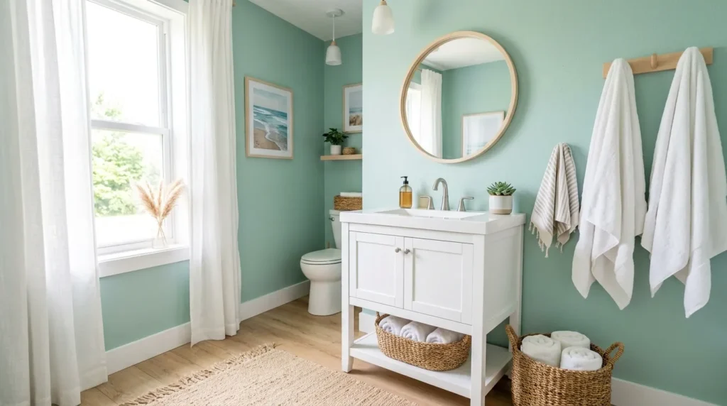
- Gives the bathroom a fresh, light, coastal feeling
- Works with white tile, pale wood, chrome, and natural textures
- Adds color while keeping the room airy and clean
- Great for small bathrooms, beach homes, and guest baths
- Creates a cheerful yet relaxing atmosphere
Seafoam green is a refreshing bathroom color that feels light, clean, and gently coastal. It brings a soft mix of green and blue, which makes the space feel peaceful without becoming too serious. This shade works especially well in bathrooms with white tile, pale wood accents, chrome fixtures, and natural woven textures. It is a good option when you want more personality than white but still want the room to feel open. Seafoam can brighten a small bathroom without overwhelming it.
The result is often cheerful, airy, and easy to decorate. You can style seafoam green with white towels for a crisp look, sandy beige accents for a beachy mood, or soft gray details for a modern finish. It also works nicely in guest bathrooms because it feels welcoming and fresh. For a more grown-up version, choose a muted seafoam instead of a bright aqua tone. This keeps the bathroom polished and helps the color stay beautiful through changing trends and seasonal decor.