
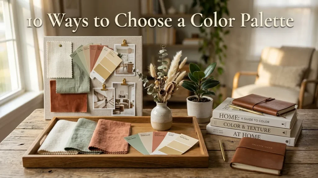
10 Ways to Choose a Color Palette
I still remember the first time I painted a room without a plan. I fell in love with a paint chip at the hardware store, brought it home, rolled it onto the walls of my living room, and by the next morning I hated it. The color that looked warm and inviting under fluorescent store lighting turned cold and flat the moment the afternoon sun hit it. That mistake taught me something I now repeat to almost every homeowner I talk to: choosing a color palette isn’t about picking a color you like. It’s about understanding how color behaves in your specific space.
A mistake many homeowners make is treating color choice as a single decision instead of a system. Walls, trim, furniture, textiles, and accessories all need to work together, and that only happens when you build a palette with intention rather than picking pieces one at a time and hoping they blend.
In my experience, the homes that feel the most put-together aren’t the ones with the most expensive furniture. They’re the ones where every color in the room feels like it belongs. That kind of cohesion isn’t luck. It’s a process, and it’s one anyone can learn.
This guide walks through ten reliable, real-world methods for choosing a color palette for your home, whether you’re working on a single room or planning colors for an entire house. You’ll find practical styling guidance for each approach, along with the reasoning behind why it works, so you can adapt these ideas to your own space with confidence.
Table of Contents
- Warm Neutral Base — Building a flexible foundation that anchors the rest of your palette.
- Cool Tone Foundations — Using cooler hues to create a calm, airy feel.
- Bold Accent Strategy — Adding one confident color without overwhelming a room.
- Monochromatic Layering — Working within a single color family for depth and calm.
- Nature Inspired Hues — Pulling palettes from the outdoors for effortless harmony.
- Undertone Testing — Why undertones matter more than the color name on the can.
- Lighting Considerations — Adjusting your palette for the light your room actually gets.
- Fixed Element Matching — Building around floors, countertops, and cabinetry you can’t change.
- Sample Board Testing — Testing before committing with a simple, low-cost method.
- Room Flow Continuity — Carrying color logically from room to room.
1. Warm Neutral Base
Quick Benefits
- Creates a flexible foundation that works with almost any accent color
- Feels timeless rather than trend-driven
- Hides everyday wear better than stark white
- Pairs easily with both modern and traditional furniture
- Photographs beautifully for Pinterest and listing photos
Why It Works
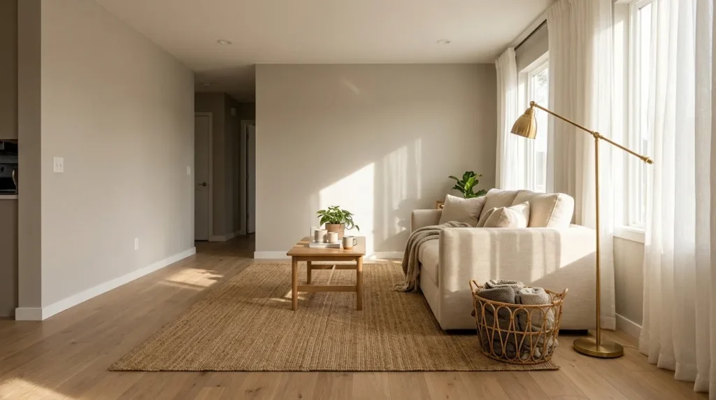
A warm neutral base — think soft greige, warm white, or muted sand — gives a room a settled, grounded feeling without competing with anything else in the space. In my experience, warm neutrals are the single most forgiving starting point for a color palette because they shift subtly depending on what you pair with them. Add navy and brass, and the room feels classic. Add sage and rattan, and it feels organic. That’s why many designers recommend starting here rather than committing to a trend color first, since a neutral base gives you room to change your mind about accents later without repainting.
How To Style It
Start with a warm off-white or greige on the main walls, then bring in one or two supporting neutrals in your textiles — a linen sofa, a jute rug, or woven baskets add texture without adding competing color. Once the base is in place, layer in warm wood tones through furniture and flooring, then decide on an accent color last. This order matters: painting last after you’ve already chosen furniture often leads to a mismatched palette, while starting neutral keeps every future decision easier.
2. Cool Tone Foundations

Quick Benefits
- Makes small rooms feel more open and airy
- Balances rooms that get strong, warm afternoon light
- Pairs naturally with marble, chrome, and glass
- Creates a spa-like, restful atmosphere in bedrooms and bathrooms
- Works especially well in north-facing rooms
Why It Works
Cool tones — soft blues, muted greens, and cool grays — bring a sense of calm that warm palettes can’t replicate. I’ve noticed this matters most in bedrooms and bathrooms, where the goal is rest rather than energy. A cool palette also has a practical benefit: it visually recedes, which makes walls feel farther away and ceilings feel higher. That’s especially useful in smaller homes or rooms with low natural light, since a cool tone won’t feel as heavy as a saturated warm color can in a tight space.
How To Style It
Choose a cool gray-blue or soft sage for the walls, then keep your trim a clean, slightly cooler white rather than a warm cream, which can clash. Bring in cool metals like chrome, nickel, or brushed steel for hardware and lighting, and let one or two warm textures — a wood side table, a woven throw — keep the room from feeling cold or clinical. This one warm touch per room is a simple trick I always suggest, because an all-cool palette can start to feel sterile without it.
3. Bold Accent Strategy
Quick Benefits
- Adds personality without a full room repaint
- Easy to update later as trends or tastes change
- Draws the eye to a focal point, like a fireplace or entry
- Works in rentals through removable options
- Creates strong Pinterest-worthy visual moments
Why It Works
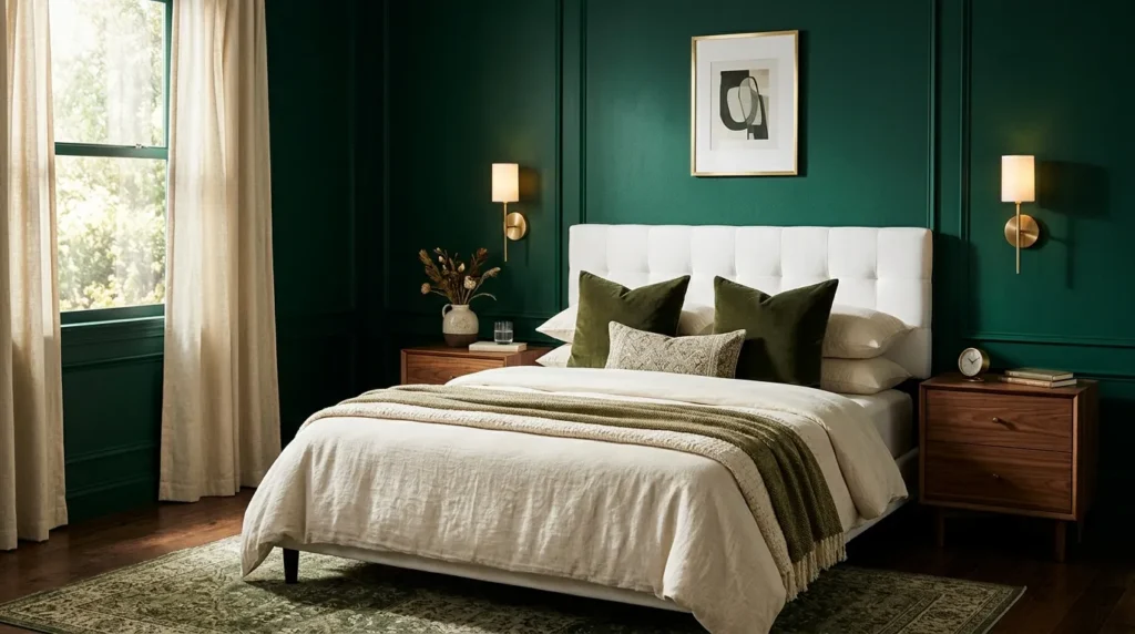
A bold accent color, used sparingly, does more for a room’s personality than an entire wall of saturated color ever could. One thing that works especially well is choosing a single deep, confident color — emerald, terracotta, or deep navy — and using it in one deliberate spot rather than spreading it evenly through the room. This keeps the palette from feeling chaotic while still giving the space a memorable focal point. Bold accents also age well because they’re contained; if your taste changes, you’re repainting one wall or swapping one chair, not overhauling the whole room.
How To Style It
Pick one wall, one large piece of furniture, or one set of cabinets as your bold moment, and keep everything surrounding it neutral so the color has room to breathe. A deep green accent wall behind a bed, paired with warm wood nightstands and white bedding, reads as intentional rather than overwhelming. If you’re renting, achieve the same effect with a bold headboard, a statement rug, or a gallery of framed art in your chosen accent color instead of paint.
4. Monochromatic Layering
Quick Benefits
- Creates a calm, cohesive feel without much effort
- Makes a small space feel larger and more unified
- Easy to execute since you’re working with one color family
- Adds depth through texture instead of contrasting colors
- Works well for open floor plans
Why It Works
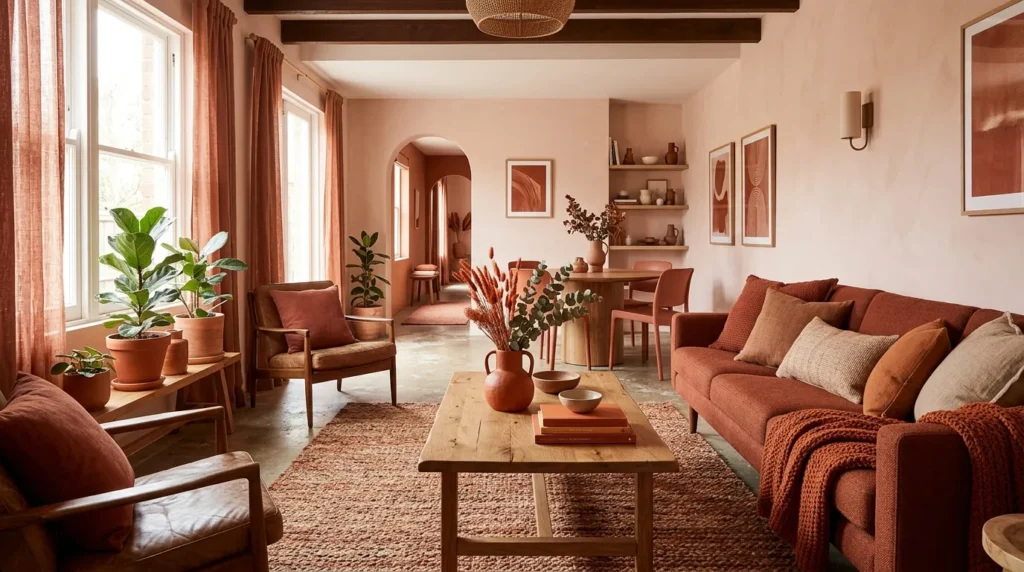
A monochromatic palette uses varying shades and tints of a single color rather than several different hues, and it’s one of the easiest ways to guarantee a cohesive result. I’ve seen this idea transform spaces that previously felt busy or disjointed, simply because removing color contrast lets the eye focus on shape, texture, and light instead. This approach works especially well in open floor plans, where sightlines carry from room to room and mismatched colors are more noticeable.
How To Style It
Choose a single color family — soft blues, warm terracottas, or greens — and use light, medium, and dark values of that color across walls, furniture, and textiles. Keep the lightest shade on the largest surfaces, like walls and ceilings, and reserve the darkest values for smaller accents like pillows or artwork. Because there’s no competing color to balance, focus your styling effort on texture instead: linen, wood, ceramic, and woven fibers all keep a monochromatic room from feeling flat.
5. Nature Inspired Hues
Quick Benefits
- Feels effortless because the palette already exists in nature
- Works well across farmhouse, coastal, and modern styles
- Naturally calming and easy to live with long-term
- Simplifies decision-making by giving you a built-in reference
- Pairs beautifully with natural materials like wood and stone
Why It Works
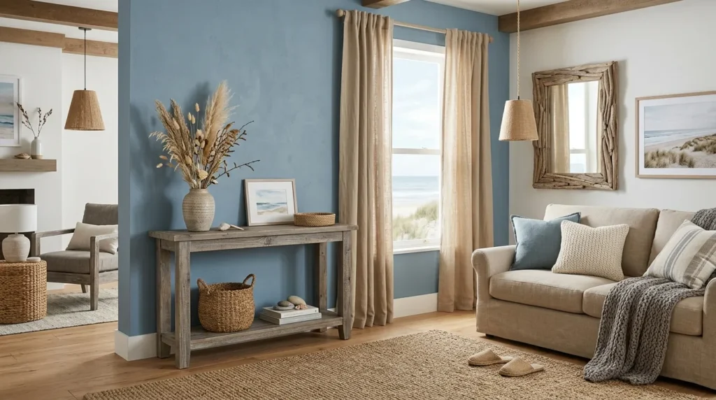
Some of the most successful palettes I’ve helped put together didn’t come from a paint deck at all — they came from a photo of a forest, a beach, or a garden. Nature already balances color in a way that feels instantly right, because the human eye is used to seeing these combinations together. Sage green with warm sand, dusty blue with driftwood gray, terracotta with olive — these pairings work because we see them outdoors every day, which makes them feel familiar rather than forced.
How To Style It
Pick a favorite outdoor scene — a beach at sunset, a pine forest, a desert landscape — and pull three to five colors directly from it. Use the most muted, dominant color as your wall color, the next as a supporting furniture tone, and the boldest as an accent through pillows or art. Bring in the actual materials that echo the palette, like reclaimed wood, linen, or stone, so the room doesn’t just reference nature in color but in texture too.
6. Undertone Testing
Quick Benefits
- Prevents the most common and frustrating paint mistakes
- Ensures your palette looks intentional rather than accidental
- Helps colors that “shouldn’t” clash actually work together
- Saves money by avoiding repeated repainting
- Builds a palette that holds up across different times of day
Why It Works
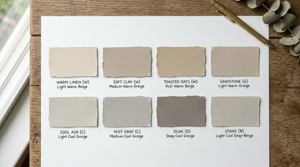
Every color has an undertone — a subtle secondary hue hiding beneath the main color — and undertones are the reason two colors that look great on paper sometimes clash badly on the wall. A “greige” with a pink undertone next to a “greige” with a green undertone will look mismatched even though both are technically neutral. That’s why many designers recommend checking undertones before finalizing a palette, since this single step prevents the majority of color complaints I hear from homeowners after a project is finished.
How To Style It
Hold your paint chip against a plain white sheet of paper in natural daylight, which makes undertones far easier to spot than under artificial light. Compare it against your existing fixed elements — flooring, countertops, tile — to check whether the undertones agree. If your floor has warm yellow undertones, a paint with cool blue undertones will fight it, even if both colors seem neutral at first glance. When in doubt, test two candidates side by side rather than one at a time; undertones are much easier to see in comparison.
7. Lighting Considerations
Quick Benefits
- Prevents colors from looking completely different than expected
- Accounts for both natural and artificial light sources
- Helps north- and south-facing rooms use color more successfully
- Reduces the need for repainting after the fact
- Improves how a palette photographs for Pinterest and social sharing
Why It Works
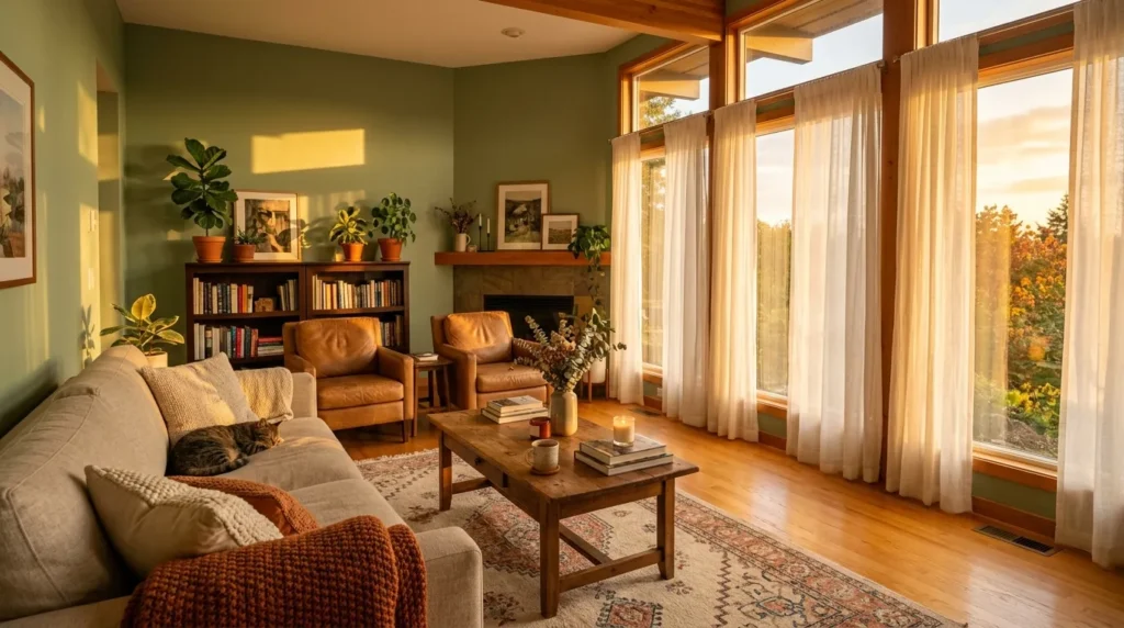
Lighting changes color more dramatically than most people expect, and it’s the single biggest reason a paint color looks different at home than it did in the store. North-facing rooms receive cooler, more indirect light, which can make warm colors look muddier and cool colors look even cooler. South-facing rooms get warmer, stronger light that can wash out pale colors and intensify saturated ones. I’ve noticed that homeowners who skip this step are the ones most likely to end up repainting within a year.
How To Style It
Test your paint choices in the actual room, not just under store lighting, and view the swatch at multiple times of day — morning, midday, and evening — before committing. In rooms with limited natural light, lean toward warmer undertones to prevent a cold, gray cast. In very bright, sun-drenched rooms, choose slightly deeper or more muted shades than you think you need, since strong light will lighten the color’s appearance once it’s on the wall.
8. Fixed Element Matching
Quick Benefits
- Prevents costly mismatches with elements you can’t easily change
- Creates a cohesive look between kitchens, baths, and adjoining rooms
- Reduces decision fatigue by narrowing your color options
- Keeps resale value in mind for major surfaces
- Simplifies future decorating decisions
Why It Works
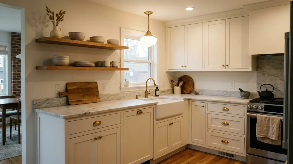
Countertops, flooring, tile, and cabinetry are expensive to replace, so any color palette should be built around these fixed elements rather than against them. If you’re anything like me, you’ve seen a beautifully painted room look off simply because the wall color fights with the existing floor. Building your palette around what’s already permanent in the space saves money and prevents the frustrating experience of a “finished” room that still feels unresolved.
How To Style It
Start by identifying the undertone of your largest fixed element, whether that’s hardwood flooring, tile, or countertop stone, and treat that as the anchor for your entire palette. Choose wall colors, furniture, and textiles that share or complement that undertone rather than contrast with it. If your fixed elements include multiple undertones — a warm floor with cool countertops, for example — choose a true neutral wall color to bridge the two rather than leaning fully warm or cool.
9. Sample Board Testing

Quick Benefits
- Lets you preview a palette before spending on paint or furniture
- Prevents expensive full-room mistakes
- Makes it easy to compare multiple options side by side
- Works for renters who can’t paint walls
- Doubles as a Pinterest-ready inspiration board
Why It Works
A sample board is a small, physical collection of your paint chips, fabric swatches, and material samples arranged together the way they’ll appear in the finished room. One simple trick I always suggest is building this board before buying anything, because seeing colors and textures side by side reveals problems that are easy to miss when shopping one item at a time. A palette that looks great in isolated pieces can look completely different once combined, and a sample board catches that early.
How To Style It
Gather your paint swatches, fabric samples, and any material references like tile or wood stain, then arrange them in the proportion they’ll appear in the room — mostly your base neutral, a supporting secondary tone, and a small accent piece. View the board in the actual room’s lighting at different times of day before finalizing anything. If something feels off on the board, it will feel off at full scale too, so treat this step as your cheapest insurance against a costly mistake.
10. Room Flow Continuity
Quick Benefits
- Creates a cohesive feel as you move through the home
- Prevents jarring transitions between open rooms
- Makes smaller homes feel larger and more intentional
- Simplifies future decorating in adjoining spaces
- Increases perceived value for potential buyers
Why It Works
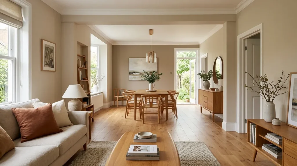
A color palette shouldn’t stop at a doorway. In open-concept homes especially, colors that clash from room to room create a visual break that makes the whole house feel disjointed, even if each individual room looks fine on its own. I’ve seen this idea transform spaces where homeowners had chosen a different bold color for every room; simplifying to one flowing palette with room-to-room variation in value, rather than hue, made the entire home feel considerably larger and more coordinated.
How To Style It
Choose one core color family for your main living areas, and vary the intensity rather than the hue as you move from room to room — a soft version in the living room, a slightly deeper version in a connected dining space, for example. Reserve your boldest, most distinct colors for enclosed rooms like bedrooms or a powder bath, where the color won’t visually clash with an adjoining space. Trim and ceiling colors should stay consistent throughout connected areas to reinforce the sense of flow.
Frequently Asked Questions
How many colors should be in a home color palette? Most successful palettes use three to five colors total: one dominant neutral, one or two supporting tones, and one accent color. Sticking to this range keeps a space cohesive without feeling flat, and it gives you enough variation to layer texture and depth throughout the room.
Should I choose paint colors or furniture first? Choose your fixed elements and furniture direction first, then build your paint colors around them. Paint is the easiest and cheapest element to change, so treating it as the final decision rather than the first one prevents mismatches with pricier, harder-to-change pieces.
How do I know if a color has a warm or cool undertone? Compare the swatch against a plain white sheet of paper in natural daylight. Warm undertones will read slightly yellow, pink, or orange, while cool undertones will read slightly blue, green, or purple. Comparing two candidates side by side makes undertones much easier to spot than viewing one alone.
Can I use the same color palette throughout my whole house? Yes, and in most cases this creates a more cohesive, higher-end feel. Keep your core neutral consistent throughout connected spaces, then vary the intensity or introduce a single new accent color in individual rooms like bedrooms to keep things from feeling repetitive.
What’s the biggest mistake people make when choosing a color palette? Choosing colors in isolation rather than testing them together in the actual room’s lighting. A color that looks perfect on a paint chip or in a showroom can look completely different once it’s on your walls, especially if the room’s natural light differs from where you first saw the color.
Do bold colors make a small room feel smaller? Not necessarily. A bold color used as a single accent, rather than spread across every wall, can actually create a stronger focal point without making the room feel cramped. The key is balancing the bold moment with plenty of neutral space around it.
How often should I revisit my home’s color palette? There’s no set timeline, but many homeowners naturally reassess every five to ten years as furniture, flooring, or personal taste evolves. Starting with a flexible neutral base makes future updates easier, since you’re typically only changing accents rather than starting over completely.
Conclusion
Choosing a color palette for your home doesn’t have to feel overwhelming, and it definitely doesn’t require getting it perfect on the first try. What matters most is building your palette with intention: starting from a solid neutral or fixed element, testing colors in your actual lighting, and layering in accents that reflect your personality without overwhelming the space.
Whether you lean toward a warm neutral base, a bold single accent, or a full nature-inspired palette, the same principles apply across every style and budget. Test before you commit, build around what you can’t easily change, and let your palette flow naturally from room to room instead of treating each space in isolation.
Start with one or two ideas from this list rather than trying to apply all ten at once. A color palette built gradually and thoughtfully will always feel more cohesive than one chosen all at once under pressure. Give yourself permission to test, adjust, and live with a color for a little while before deciding it’s final — the best palettes are the ones that feel effortless precisely because of the care that went into choosing them.
Related Articles
- Cozy Bedroom Ideas
- Small Living Room Layouts
- Modern Farmhouse Decor
- Neutral Home Styling
- DIY Accent Wall Ideas